My journey to apply the Munsell color system to Photoshop.
In 2014, I decided to make the leap from being an artist who works with traditional pigments to an artist who works digitally with a pen and tablet in Photoshop.
Most of my work as an illustrator eventually ends up in print, so making the switch was logical. Working digitally eliminates the intermediate step of taking physical artwork and scanning it into a digital form for reproduction (which can result in unexpected value and color shifts depending on whoever is operating the scanner).
However, switching to digital painting presented new challenges to solve — many relating to color.
For example, I know how to mix Flake White with Yellow Ochre and a touch of Cadmium Red to achieve a flesh tone. But where is Flake White, Yellow Ochre and Cadmium Red in the digital universe? Where do various flesh tones reside?
Questions like this launched me on a quest to find a system for accurately visualizing and then choosing digital colors. The requirements I sought were:
- Easy to access while painting in Photoshop (obviously);
- Easy to define the location of colors and visualize how they relate to one another in the digital universe; and
- Easy to determine whether colors are achievable for reproduction in print (a.k.a., “within gamut”), or unattainably outside gamut — and hence should be banned from my digital palette.
In short, I wanted something like the Munsell color system for Photoshop.
Note: The Munsell color system defines colors by three distinct characteristics: Hue, Value, and Chroma. Simple. Logical. Good.
The journey to create a digital color wheel begins with four color modes
Inherently, Photoshop has four color models to pick from for specifying colors. The two that you are probably already familiar with are:
- CMYK (cyan, magenta, yellow, and black) which are the inks used for reproducing a large range of colors in print.
- RGB (red, green, and blue) which are specific light wavelengths used for displaying millions of colors on digital screens.
Then there are the two that you are probably less familiar with:
- HSB (hue, saturation, brightness)
- LAB (Lightness axis, a* color axis, and b* color axis)
Testing the CMYK and RGB color modes
Because of my familiarity with the CMYK and RGB color modes, I initially gravitated toward exploring them for defining colors in digital painting. I could look at a Pantone process color guide, find the swatch matching closest to Yellow Ochre, for example, and then assign either the CMYK or RGB values in the Adobe Color Picker (similar to the process I’ve done many times before for graphic design projects).
But I often found the process of painting with these Pantone chosen colors frustrating because: A) I rarely found swatches that were a clear match to my artist pigments; B) judging the resulting mixed colors and how they might print was often tedious; and, ultimately, C) it was mostly guess work defining the characteristics of colors and how they relate to one another with this method.
Testing the HSB color mode
I eventually migrated towards the HSB color mode. Like the Munsell color system, I could choose a Hue angle for colors. I knew how one color related to another by how far apart their Hue angles were. The experience started off great.
But it was in this color mode’s Saturation and Brightness components that I became frustrated. A decidedly unsaturated dark color can have a high Saturation value, and a mid-gray value color can have a high Brightness value (see the upper and lower right corners of the “picked color” chart in Figure 1).
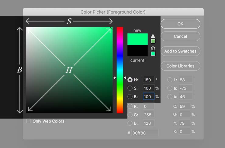
The 150° Hue angle is shown filling the “picked color” chart. Saturation spans the horizontal axis and Brightness spans the vertical axis.
While I found the HSB color mode to be an improvement over either the CMYK or RGB modes for defining colors, I still longed for Munsell’s Chroma and Value over this mode’s Saturation and Brightness.
Moving on to the LAB color mode
Unsatisfied with all the other color modes available in Photoshop, I finally focused my attention on the most mysterious one: LAB. While there is a learning curve to understanding this color mode, it would prove to answer all my requirements for the digital color system I was seeking.
Visualizing the LAB color space
Photoshop’s LAB mode is based upon the CIELAB color model developed in 1976 by the French International Commission on Illumination.
Looking at Figure 2 below, if you are familiar with the Munsell color system, you will immediately notice how CIELAB resembles the former. As with Munsell, the Value of colors in CIELAB increase as they rise up the central L* (Lightness) axis. Likewise, the Chroma (a.k.a. Saturation) of colors increase as they move away from the neutral gray center towards the outer limits of the CIELAB a*b* plane.
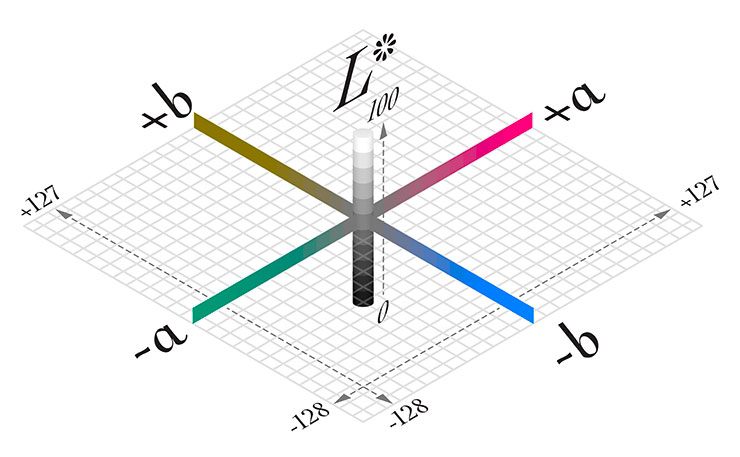
All the colors in the CIELAB model can be visualized inside a squashed cube that is 100 units tall along its L* axis and 255 units wide along both its a* and b* axes. An a*b* plane is represented here at the L*=50 level.
Before moving on to discussing how CIELAB handles the Hue characteristic of color, like Munsell, I would note that I too am not a fan of using “color names”. What I consider to be “red” is unlikely to be the same “red” that you imagine. Yes, we likely can agree that our general conceptions of “yellow”, “blue”, or even “chartreuse” are clearly not “red”. But where to draw the exact boundary between “red” and “red-violet” is ripe for debate. Therefore, color names refer to vast neighborhoods with fuzzy borders where many Hues reside, nothing more.
In CIELAB, a color’s Hue is defined by where it lies upon the a*b* plane (a precise location, yay!). Looking again at Figure 2, you’ll notice that along the a* axis hues range from red-violet on the positive side to cyan-green along the negative side. Along the b* axis, hues range from yellow on the positive side to blue on the negative side.
To help me visualize the relationship between hues on the a*b* plane better, I added some geometry (Figure 3). First, I drew rays from the center at equal intervals of 30-degrees to define 12 primary Hue angles (two more than the 10 that Munsell used to define his color system). Next, I drew circle rings at intervals of 10-units to relate equal increases in Chroma around the plane from the center. And finally, I created a gray area by connecting the maximum Chroma that is attainable within gamut for each spoke.
Note: When we look at the a*b* plane flat, we are disregarding the Lightness characteristic of color in the CIELAB color model.
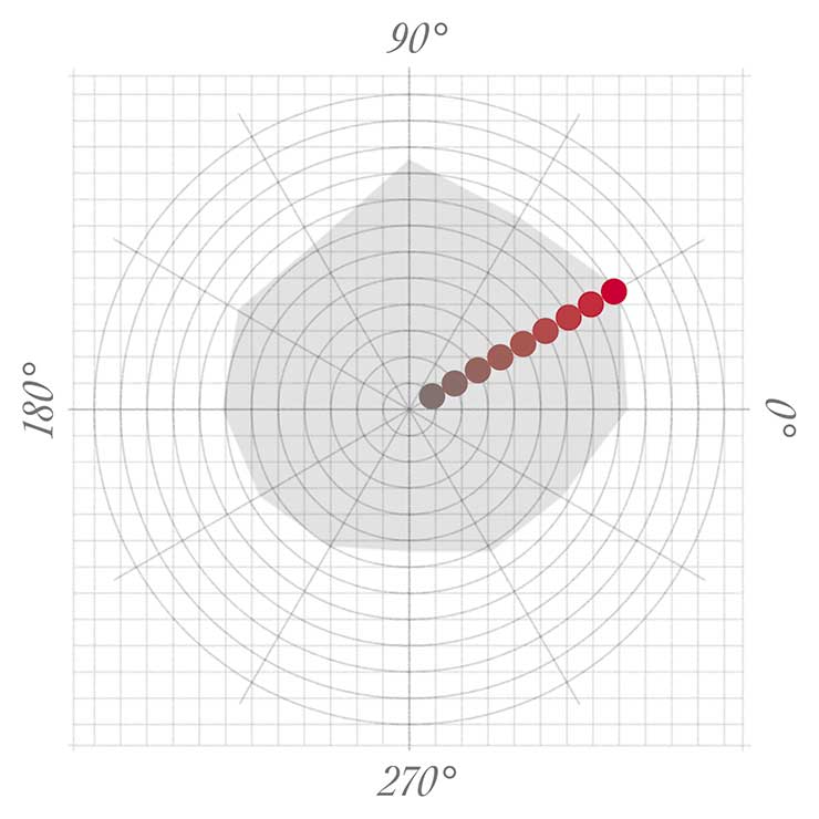
I assigned the value of “0” to the hue angle on the right that relates to a+ in CIELAB. Hue angles then increase in 30-degree increments counter-clockwise around the plane. A string of color swatches within the gamut limit are shown for the 30° hue angle (at L*=50) to illustrate how the additional geometry relates to Munsell’s definition of Hue and Chroma.
If you study the gamut limit area in Figure 3, you’ll notice that less than half of the colors available in the CIELAB color model are achievable in print. Warm colors from 30° to 90° have the highest attainable Chromas. Conversely, cool colors from 240° to 270° have the lowest attainable Chromas. This is similar to what also occurs with artist pigments.
Remember how I wanted to know where Yellow Ochre resides in the digital universe of colors? With my a*b* plane diagram drawn and the help of this chart by Bruce MacEvoy, I was able to locate it and all of my familiar artist pigments in Figure 4.
In Figure 5, I plotted the standard printing inks (Cyan, Magenta, and Yellow — Black would be in the center at L*=0) and the standard colors of light (Red, Green, and Blue).
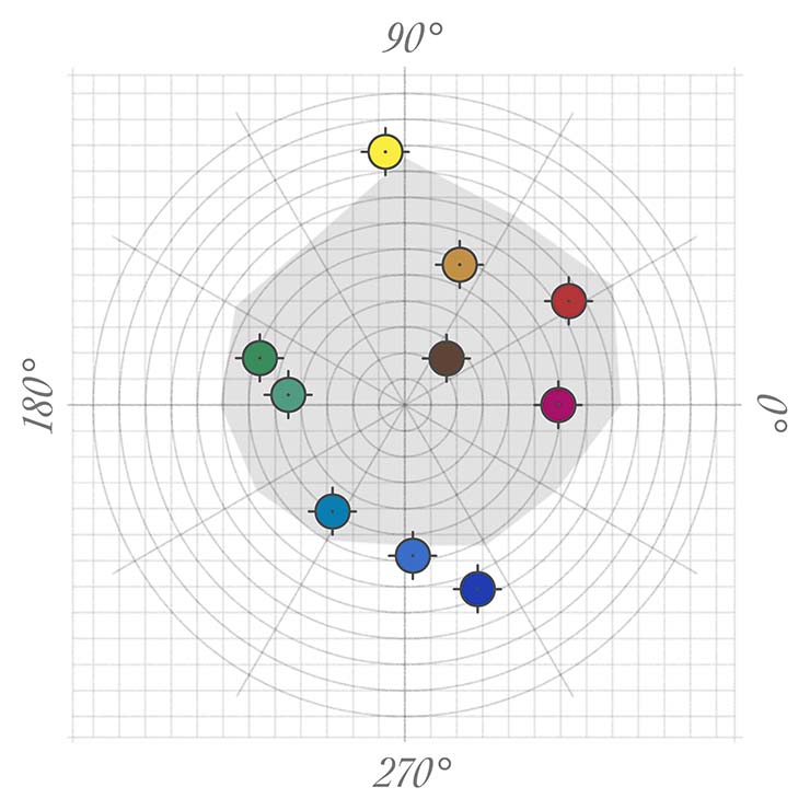
Clockwise from top: Cadmium Yellow Light, Yellow Ochre, Burnt Umber, Cadmium Red, Quinacridone Magenta, Ultramarine Blue, Cobalt Blue, Phthalo Blue, Viridian Green, Phthalo Green YS.
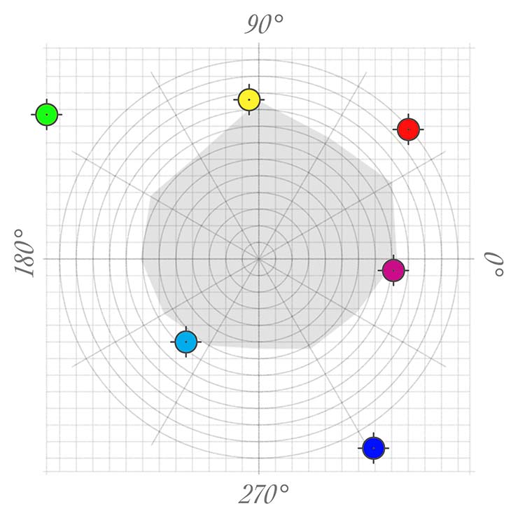
Artist James Gurney advocates using these colors in his color wheel. Note: Cyan, Magenta, and Yellow are obviously within the color gamut for printing. They appear slightly outside of gamut here, because their locations do not fall on Hue angle spokes and for simplicity I draw straight lines for gamut boundaries from one spoke to another.
Now that I understood how to define the location of colors, visualize their relationships to one another, and define color gamuts with the CIELAB color mode (my initial requirements for a digital color system), I was ready to create a color wheel for digital painting.
The Color Wheel at the end of the rainbow
Unlike most color wheels that paint the maximum chroma colors along the outer edge, I’ve kept all colors in their locations upon the CIELAB a*b* plane. By doing so, I’ve maintained the visual chromatic relationships between colors around the wheel.
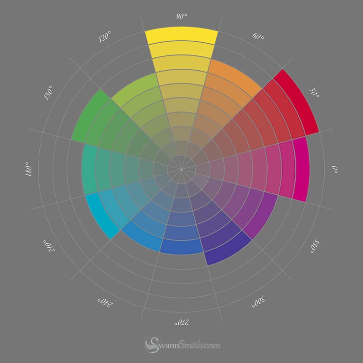
Each spoke of the color wheel is painted with its maximum Chroma color, then mixed towards an L*=50 gray at the center. Any color that extends outside this color wheel would exceed the color gamut for printing.
Here are three things that I like about working with this color wheel:
- The CIELAB color mode produces a pure “mixing” color wheel (meaning, any two complementary colors of the same Chroma will mix to an absolute neutral gray).
- Warm and cool colors are evenly divided between the wheel’s northern and southern hemispheres (you can think of the CIELAB a* axis as the equator dividing warm from cold)./li>
- Colors are easily definable and accessible in Photoshop (although having a visual representation of this color wheel in the Adobe Color Picker would be nice).
In the end, my digital color system isn’t exactly like Munsell’s, but it is easy to utilize for painting in Photoshop.
And for the record, the digital universe address for a median Yellow Ochre in L*a*b* is: 66, 21, 54 — or as I refer to it: 69°, 6.6, 5.9 (but that’s a tale for another article).
Thank you for taking the time to read this lengthy, technical article!
I hope you enjoyed the recap of how I developed my color wheel for digital painting and are able to apply at least some of the information towards your own artistic journey.
Going forward, I will be writing additional articles about how to implement this Equidistant Color Wheel into digital painting along with general color theory.
If you would like to receive updates when new articles are available, please Subscribe to my newsletter.

