After I created the illustration Zombie’s Sundae, quite a few people asked about how I did it.
While the full answer would be War and Peace epic, I hope to provide you here with a glimpse into how I create engraving style illustrations using Photoshop with a pen tablet.
Be forewarned, the style I am showing here is not for the faint of heart. There are no magical Photoshop filters involved. It requires the same time and patience to build up the line work as traditional engraving, woodcut, or scratchboard techniques. But the results, in my humble opinion, are more visually pleasing than mechanically generated halftone screens.
For this demo, I will be engraving a chipped teacup (shown below) that I plan to use within an Alice in Wonderland themed illustration. Since the teacup is a relatively simple shape, I’m hoping it will make the basic principles of this technique easier to follow. I break my process into three stages: create a cartoon, create screens, engrave.
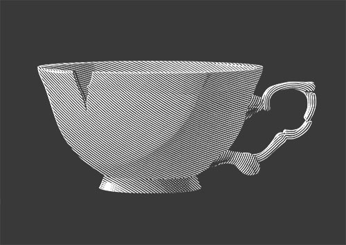
To start, I created a Photoshop file that is 9 inches by 6.5 inches at 600 dpi in grayscale mode (The 600 dpi will allow me to enlarge the artwork, if I ever desire to; and grayscale files, being smaller than either RGB or CMYK color mode, make the process of working and saving the file quicker).
Stage 1: Create a Cartoon
The cartoon below will act as my road map for the eventual engraving (btw: I’m eccentric and still use the term “cartoon” by its original meaning: as a preparatory drawing for any piece of art like a painting, tapestry, etc.).
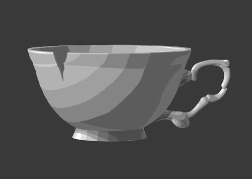
(the background gray represents the value of the color I'm planning to print on)
I love this stage, because it’s the most creative. Here is where I work out all the composition, drawing, and shading issues for my illustration. For the shading, I have broken it down into nine values with no blending (that way it’s easier for me to distinguish value breaks when I proceed to the engraving stage). I try not to get too fussy refining the edges of value breaks or rendering minute details, because they will be lost during the engraving.
TIP: Planning large areas of either pure light or pure dark values — where the area can either be filled with white or no engraving lines are necessary — will save oodles of time during the engraving stage (advice I have sadly not seemed to master yet)
Stage 2: Create Screens
Screens determine the line work of the engraving — the personality. On a new layer above my cartoon, I will draw screen lines roughly 20 lines per inch (lpi) apart. I have chosen this lpi, because it will result in less work for me than say a 40 lpi screen, but I still will be able to retain finer details that I plan to add later in my final Alice in Wonderland themed illustration. This very low lpi will also be ideal for printing on even porous surfaces like newsprint or t-shirts.
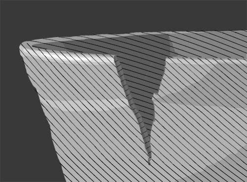
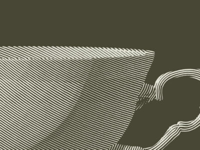
I am keeping my screen lines very uniform on the teacup bowl to mimic the smooth, even surface. The curves of the lines do not follow perspective lines (or wireframe lines, as 3D modelers would call them), because perspective lines come together as they recede in space. This would greatly alter the screen’s line spacing and throw off the shading in the next stage (a little variation is good to prevent moiré patterns, but a lot is not good). As seen above, I have created separate screens to distinguish the teacup’s outside bowl, inside bowl, and chipped edge.
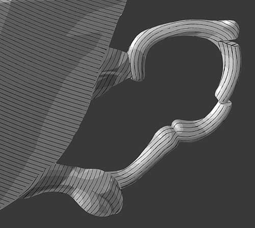
For the teacup handle, which is often more bumpy and irregular than the bowl, I am being slightly looser with my screen lines. For organic objects (e.g., hair, clouds, trees), I tend to make my screen lines even looser.
As for crosshatching, I use it as little as possible. While crosshatching helps retain greater detail, it means twice the work (ergo, time). I do make one common exception that I will discuss during the next stage.
TIP: Mixing up screens within an illustration is very important — not only to prevent moiré patterns, but to keep visual interest.
Stage 3: Engrave
Building up the “engraved” line work is a marathon task. However, with my cartoon and screens set, I am able to concentrate on the process during this stage, instead of fumbling around to get things right.
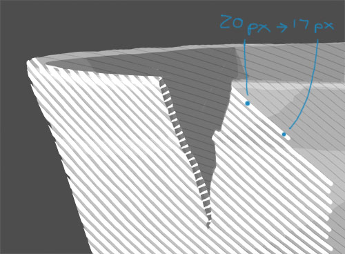
(shown at approximately 33% of actual size with the cartoon showing underneath)
I have reduced the opacity of the “screens” layer to about 30% as seen above. For each value in my cartoon, I assigned a line width. For example, to match the 33% gray of value 4, I need to use a 20 pixel wide stroke of white (my screen’s spacing is 30px, minus 20px of white, leaves 10px of dark background; i.e., 10 ÷ 30 = 33%). So, to create a transition between values 4 and 5, I draw a line along one of my screen guides that tapers from 20px for value 4 to 17px for value 5.
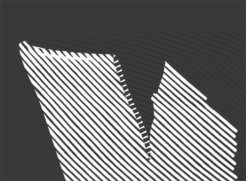
(shown at approximately 33% of actual size without the cartoon showing underneath)
For the record, I draw with regular Photoshop round brushes set to 100% hardness. I generally draw with my art magnified (as traditional engravers often do) between 200–400% for a 600 dpi file. Depending on the complexity of details and value shifts, a square inch of engraving can take from minutes to hours.
As I mentioned before, I try to avoid crosshatching to save time. However, near both ends of the value range, I crosshatch to avoid my lines from becoming either too thin or bleeding together when printed. In the completed engraving of the teacup below, you can see subtractive crosshatch lines in the shadows of the teacup’s base.

(because of the uniformity of the screen lines and the reduced scale of the artwork on your computer screen, you may be seeing a slight moire pattern in the teacup bowl)
And that’s it! What I have shared with you are the basics for a very refined engraving style. I hope you have enjoyed reading about my process and have gained some insights.
If you would like to see the illustration that this teacup was used in, see The Mad Teacup.
And, If you are crazy brave enough to give this style a try yourself, here are some suggestions:
- study engraving masters like Dürer, Rembrandt, Doré, etc.
- start simple: engrave basic geometric objects (e.g., grapes, pizza boxes, cheese wedges — hmm, I think I’m hungry), or copy/alter a portion of an existing engraving
- keep at it: you will learn a lot through trial and error
- if all else fails, and your patience wears out, adapt these principles to a looser style (as I sometimes do)

