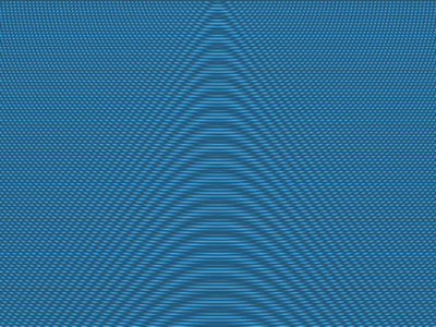
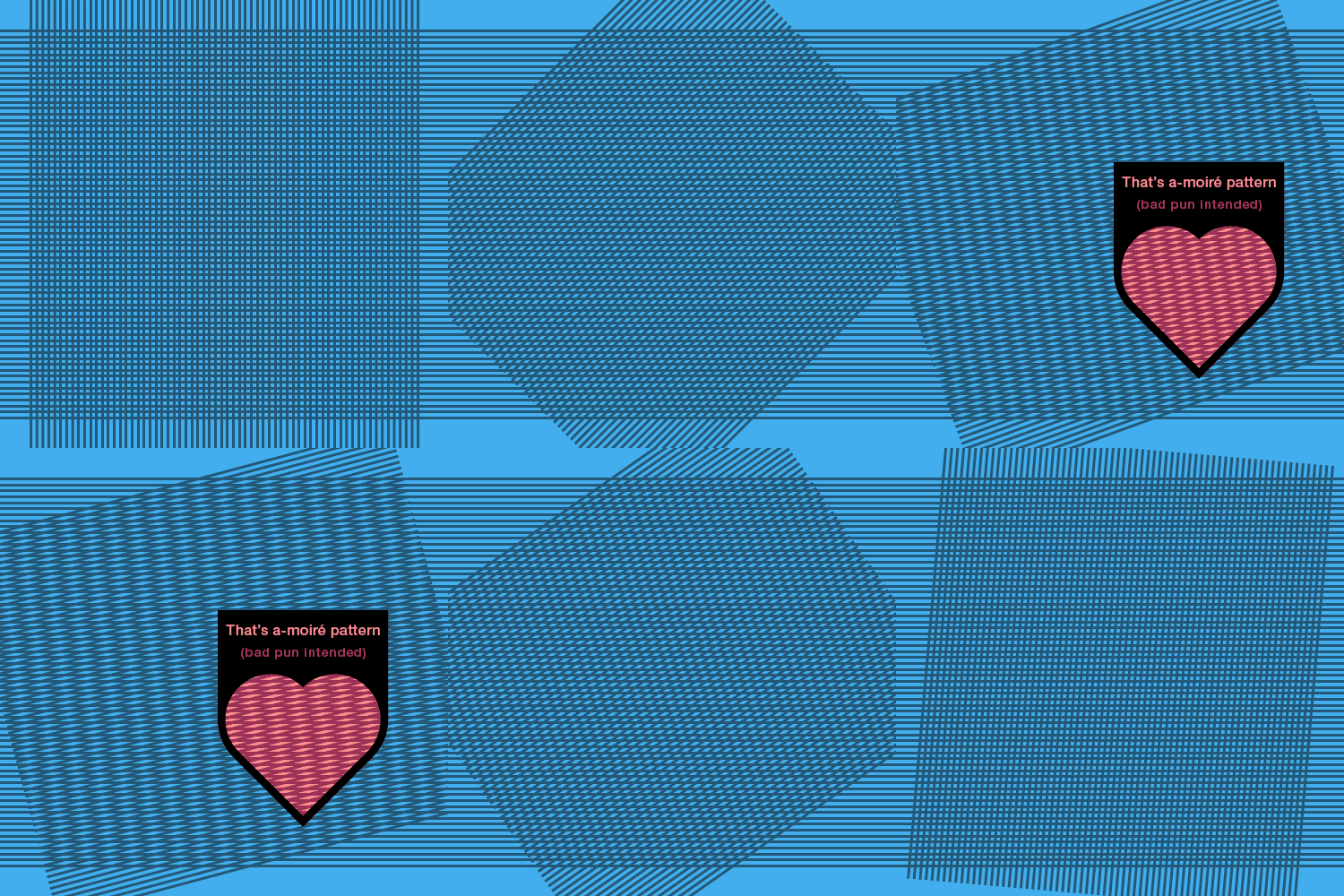
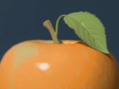
Moiré patterns are a type of optical illusion.
While there are complicated formulas that can calculate when and where they will occur, I wanted to spare my fellow illustrators and graphic designers all the math and just show you some basic principles instead (feel free to just watch or read my descriptions underneath for additional insights).
Overlaid Parallel Lines
Overlaid Dot Grids
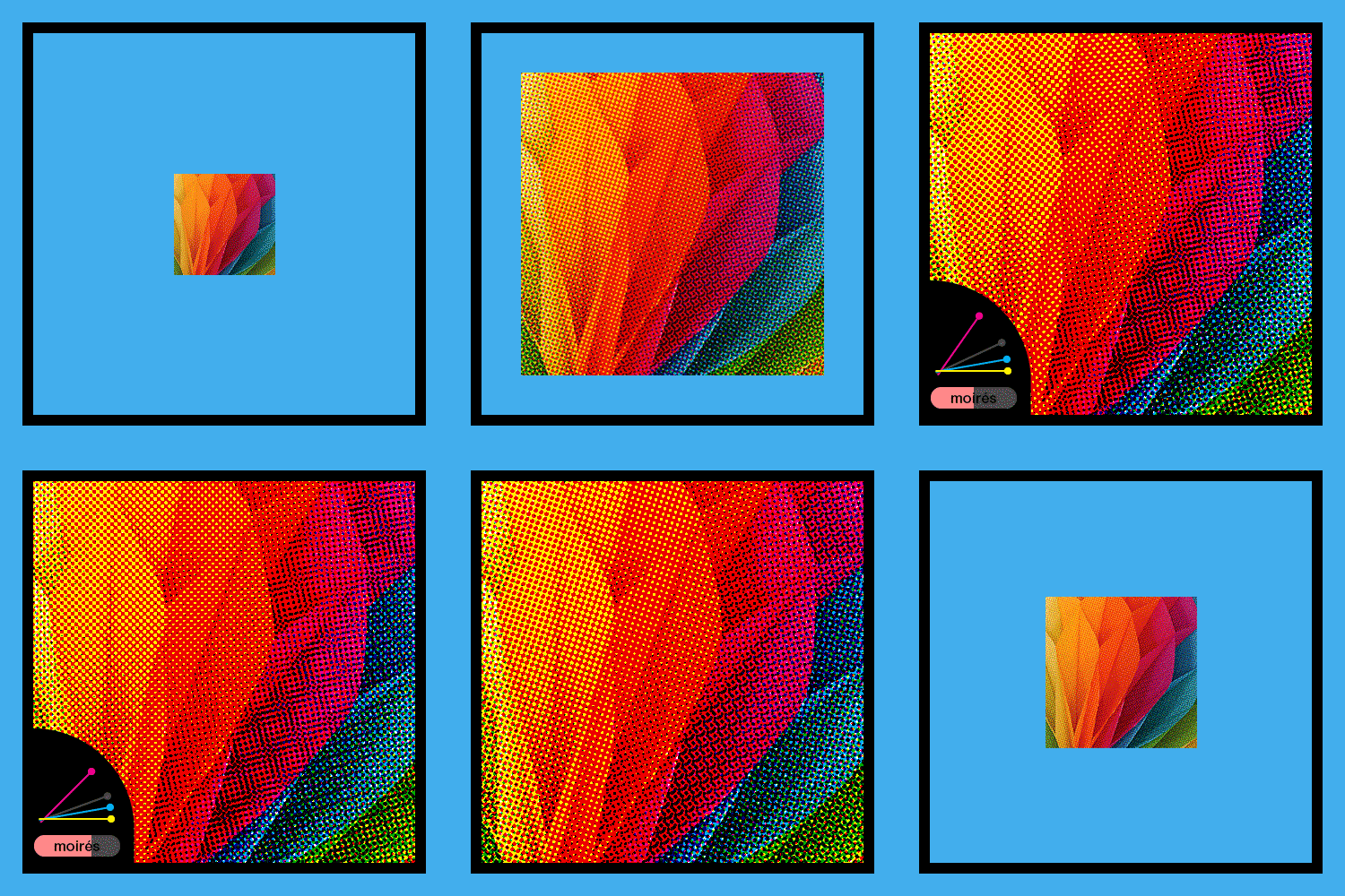
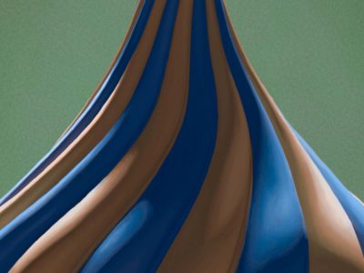
Overlaid Straight and Curved Lines
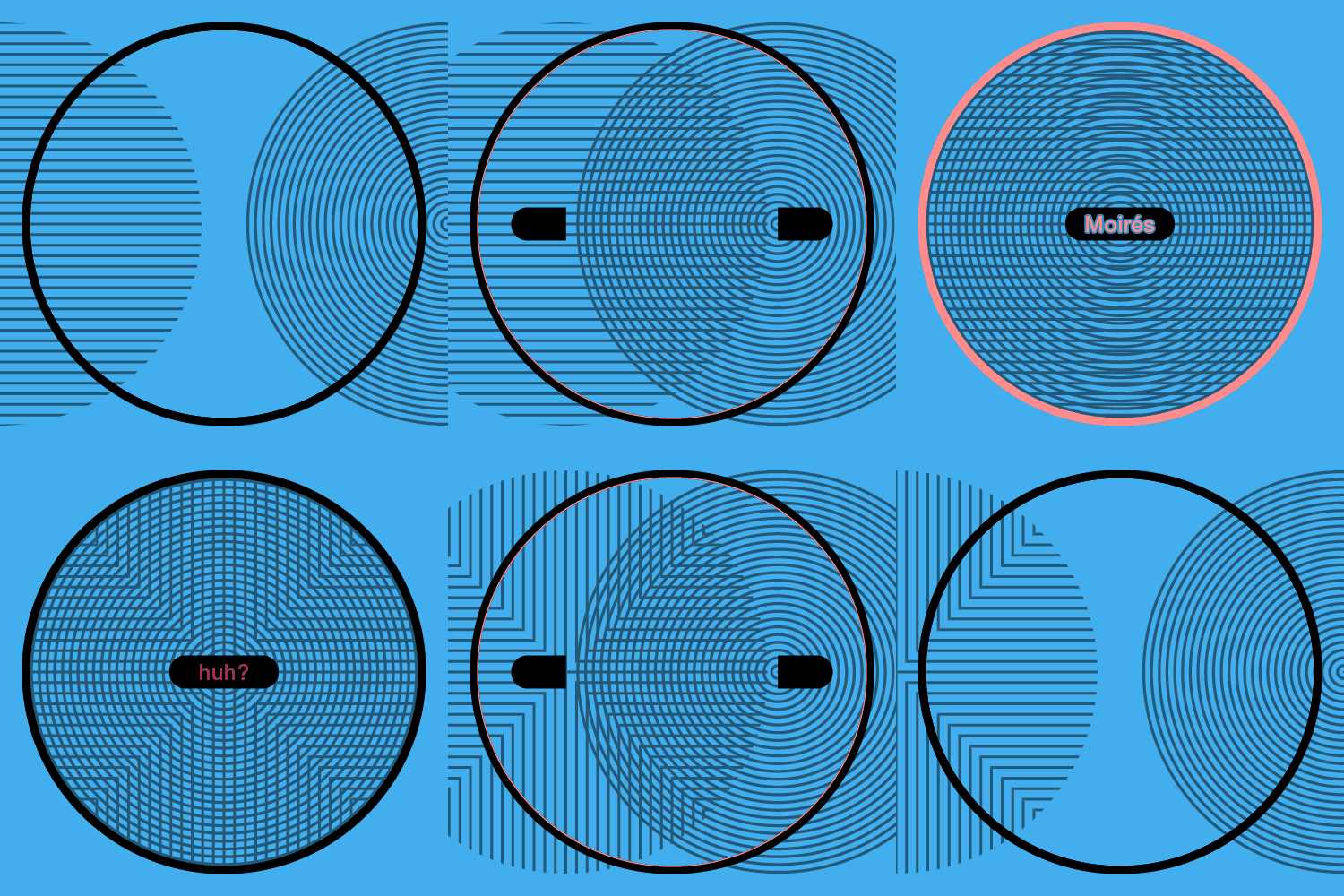
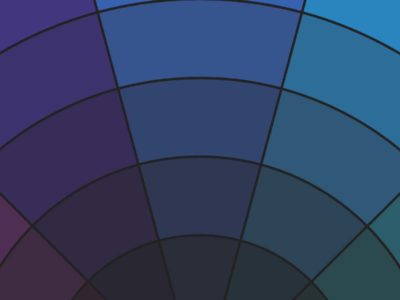
Fine Concentric Lines
Seeing this example work is highly dependent on your screen’s resolution and how close you’re viewing it (plus Photoshop, attempting to remove the moiré effect, has automatically added some noise to the lines…).

Now that you have some knowledge of what moiré patterns are and how they are created, I will leave you with a few practical tips:
For Illustrators (working in an engraving, woodcut, or scratchboard style)
- To avoid moiré patterns, keep your crosshatching lines 45–90 degrees apart.
- Consider using moiré patterns to recreate the texture of objects like shiny silk fabric, peacock feathers, etc.
For Graphic Designers
- Consider using moiré patterns as a cool optical effect (governments do on currency — although, they mostly do it to induce moiré patterns as a way of preventing counterfeiters).
- If your design or images are predominantly a certain color, you can talk with your printer about adjusting the regularly assigned screen angles of the CMYK plates to minimize moiré patterns.

