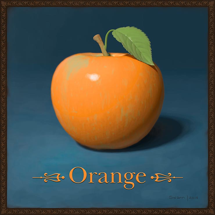
I painted this “orange” apple as an homage to the conceptual imagery created by artist Marcel Duchamp and later by legendary art director George Lois.
My Communication Design professor at Pratt Institute, David Gates, would describe this type of imagery as “visual montages.” He defined it as combining two opposite objects which share a common trait.
Professor Gates offered as a classic example of the style (which I’ve recreated below, since I’m unable to locate the original online) the word “Helvetica” set in — not Helvetica — but the Times typeface.
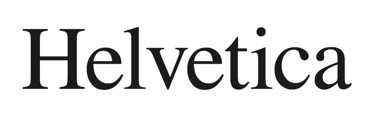
Being a sans-serif and a serif, Helvetica and Times are typographic opposites. However, what they share in common is that they were the two most popular/overused typefaces at the time.
So in this vain, I combined an apple and an orange (they’re so opposite, they have their own idiom: like comparing apples and oranges). Meanwhile, they’re both fruits. Fun.
Gilding the concept
While both Duchamp and Lois were minimalist who wouldn’t dream of dressing up their concepts, I don’t mind some ornamentation. ¯\_(ツ)_/¯
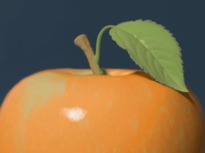
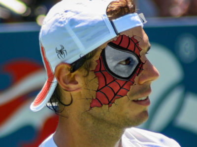
Here’s a couple details from Orange:

Art prints are available for purchase in my shop at Fine Art America.

