At last, I am proud to show you the completed San Marco Horses painting and discuss my color choices.
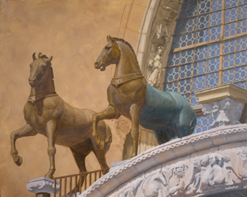
Since the last update, only two notes of color were being played: yellow-orange and reddish-blue. Nice, but subdued. Therefore, my artist’s heart leapt when the third note of bluish-green started being played upon the stars of the painting, the horses (see below).

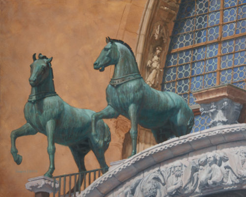
In the completed painting (see below), the bluish-green and reddish-blue harmonize with each other, while the yellow-orange contrasts with the two cool notes and makes them pop.

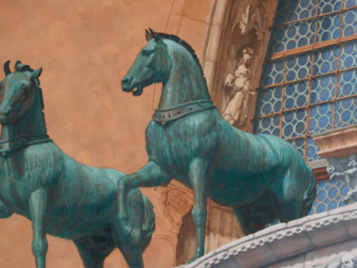
I used the natural transparency of oil paints to create an interesting play of warm and cool color notes within the horses (although it is hard to capture the effect in a photographic reproduction). The original warm bronze color can be seen through the dark bluish-green patina veil and bright bluish-green patina streaks in varying degrees.
Like most artist, I could probably continue to finesse the painting forever, but it is now time to pat myself on the back and move on to the next painting.
Thank you for following the progress of this painting. I hope you will share the experience with others and return to follow my next painting in progress.
What do you think?
I appreciate your thoughts and constructive criticisms.


