Zyvith Leberman is a full service market research consulting firm specializing in the pharmaceutical and healthcare/health insurance fields.
They distinguish themselves from their competition by being less bureaucratic, more experienced, and more responsive to client’s varied and changing needs than other firms.
I was tasked with creating an identity for the firm that conveyed the ideas: simple, thorough, and flexible.
My solution for the Zyvith Leberman’s symbol was inspired by line graphs, cardiograph lines, and helices. It visually relates to the firm’s services and the industries they cater to.

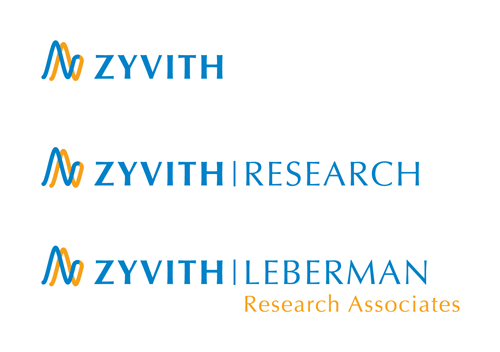
The branding hierarchy consists of a base Zyvith logo that can easily be adapted to accommodate various business entities.
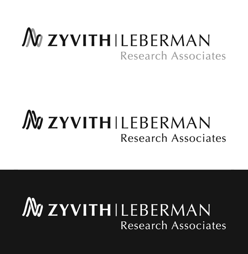
For branding applications that require the logo to be reproduced in a single-color, I provided these options.
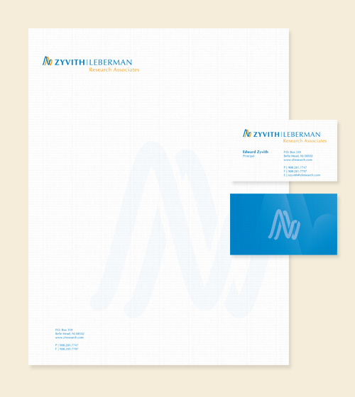
With the logo design completed, I then applied it to Zyvith Leberman’s stationery.
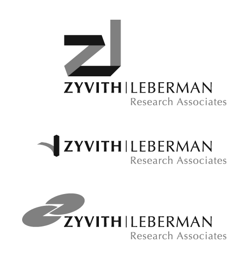
I originally provided three additional options. Two of the designs relate to my client’s request for monogram symbol solutions. In general, I like to present the initial options in black and white, so that they are judged on their design and not an emotional reaction to color(s).
Zyvith Leberman was a great client to work with, and I am happy with the result we achieved on their identity design project.
Client Comment
After working with another designer to no avail, I approached Swann with the hope of receiving a logo design that fit our firm. Swann questioned me and my business partner about our services, our personal tastes, and what we required from our logo. He returned with not one, but four excellent logo options — it was difficult choosing. Swann is very thorough, knowledgable, and creative at what he does.”
— Edward Zyvith, Principal

